Responsible AI / Monitoring
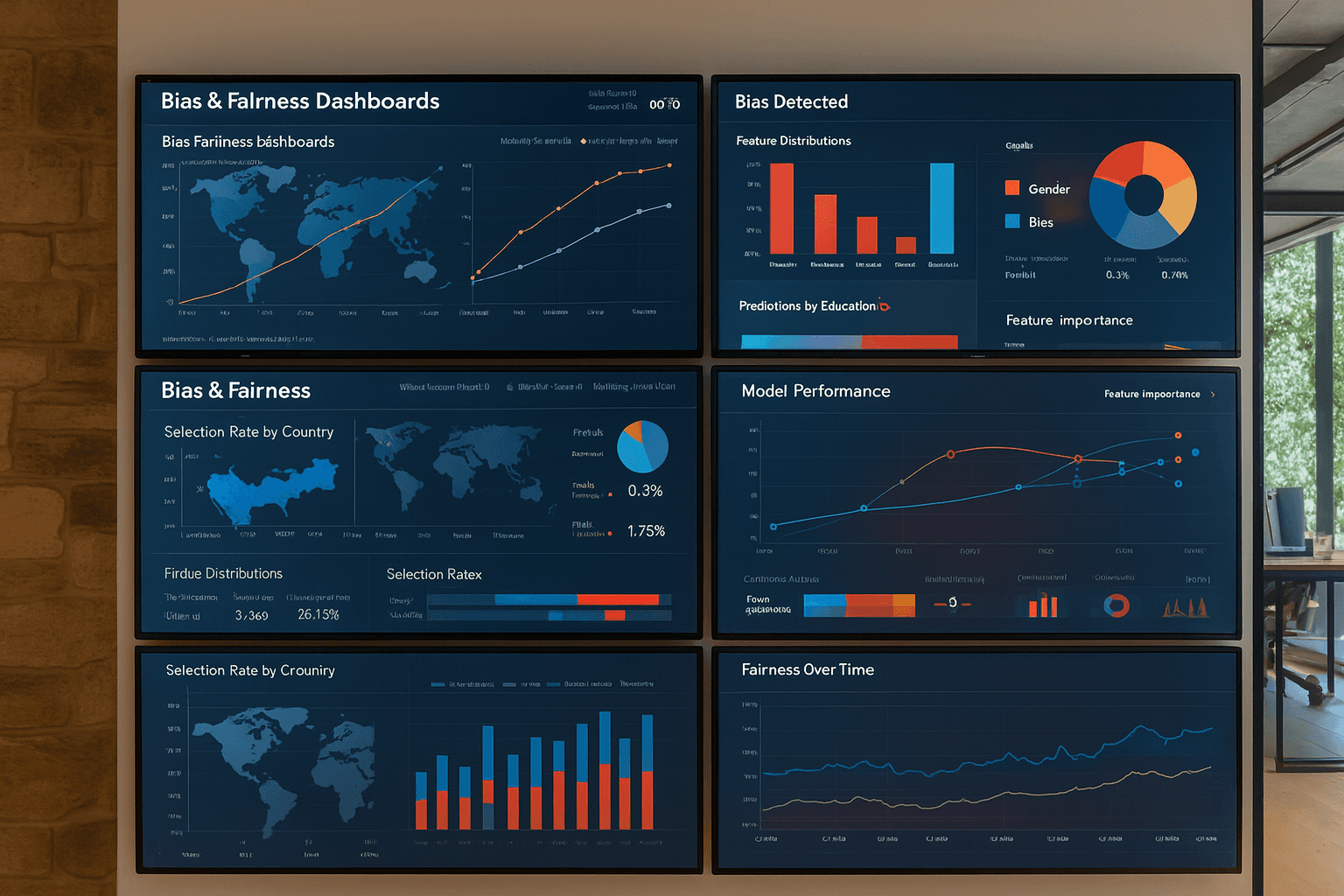
Bias & Fairness Dashboards: Implementation Guide
Bias and fairness aren’t just abstract ethics—they’re trackable performance metrics. This guide shows how to implement scalable dashboards that surface bias, communicate risk, and help your teams build responsible AI with confidence.
From Principles to Practice: Making Fairness Measurable
Introduction: The Rising Stakes of Algorithmic Accountability
In an era of algorithmic decision-making, bias and fairness are no longer soft topics. AI systems now decide who gets a loan, who gets hired, what medical diagnosis is prioritized, and even how insurance premiums are calculated. As these decisions increasingly affect lives, regulators and the public alike are demanding accountability.
But the challenge is not merely building fair models—it’s maintaining them in live production environments where data changes, user behavior evolves, and models drift. To respond, organizations must move beyond static fairness audits and toward something more dynamic: bias and fairness dashboards that allow continuous oversight and action.
Making Bias Visible
The fundamental shift lies in treating bias not as a one-time statistical test but as a model performance characteristic—something observable, measurable, and monitorable over time.
Bias dashboards serve this exact purpose. They transform fairness from an abstract ethical goal into a trackable set of signals, much like accuracy or latency. By surfacing disparities across protected attributes (such as race, gender, geography, or age), these tools help AI teams—and their cross-functional partners—detect, interpret, and respond to model behaviors that deviate from fairness thresholds.
Crucially, these dashboards offer shared visibility. When implemented well, they bridge technical and non-technical roles, allowing product teams, legal advisors, risk officers, and policy leads to engage with bias proactively rather than reactively.
What Should Be Monitored?
While fairness is contextual and multidimensional, several core patterns emerge in robust dashboard implementations. The most meaningful dashboards include visualizations for:
- Selection rates and outcome distributions across groups
- False positive/negative rates disaggregated by sensitive attribute
- Alert thresholds, automatically triggered by drift or disparity shifts
- Historical trends, showing fairness over time and across model versions
- Explanatory overlays, such as model features, weights, or known limitations
This isn’t about perfection—it’s about tracking signals of risk and contextualizing them. If a fraud model begins rejecting significantly more applications from a specific demographic than it did before, the dashboard should surface that deviation clearly, with supporting data and relevant audit logs.
Cross-Functional Collaboration: A Cultural Shift
Perhaps the most underestimated value of fairness dashboards is not technical—it’s cultural.
Static documentation or internal Jupyter notebooks rarely reach governance and legal teams. Dashboards, when properly built and shared, open a communication loop between data scientists and downstream stakeholders. This enables a more deliberate, proactive governance posture.
For instance, when a recruitment platform's model begins underperforming for applicants from rural regions, that issue doesn't remain buried in a data team’s backlog—it becomes a live alert that legal, DEI, and compliance teams can evaluate and escalate.
To enable this, fairness dashboards should feature:
- Clear role-based access to filter technical depth by audience
- Human-readable labels and tooltips
- Scheduled digests or notifications for significant metric changes
- Easy export or documentation to feed audit trails and compliance reviews
Technical Foundations and Deployment Practices
Building a fairness dashboard is not merely about plugging in a visualization tool. It involves thoughtful data engineering, automation, and integration with your broader ML lifecycle.
At Microcorem, we recommend that teams begin by integrating bias evaluation directly into model pipelines, using open-source tools like Fairlearn, Aequitas, or Arize AI. Outputs are logged, versioned, and connected to model metadata (such as training sets, hyperparameters, and usage policies). These are then surfaced in a unified interface—built with tools like Grafana, Superset, Streamlit, or even custom React dashboards.
The goal is to embed fairness into observability, not treat it as an afterthought.
Why This Matters Now
With AI regulations tightening across the EU, UK, Canada, and U.S., especially under the EU AI Act and Canada’s AIDA, operationalizing fairness isn't just a nice-to-have—it's a legal necessity. Companies deploying high-risk AI systems will be required to show clear records of risk detection, mitigation, and human oversight.
But regulation aside, dashboards build internal trust too. They help product leaders sleep at night knowing the model running in production hasn’t quietly shifted into discriminatory behavior. They give developers clarity. They offer transparency for affected users. And they build public credibility when companies can show—not just say—that their systems are fair.
Conclusion: Turning Signals into Action
Bias and fairness dashboards are not silver bullets—but they are essential lenses. They turn ethics into engineering, and principles into practice. By making fairness visible, they allow your organization to detect harm early, respond responsibly, and evolve your models with confidence and care.
As AI continues to shape critical decisions at scale, observability will define responsibility. And dashboards will be the bridge.
Further Reading
- Google Fairness Indicators
- IBM AI Fairness 360 Toolkit
- Microsoft Fairlearn
- World Economic Forum – Responsible AI Standards
- Fiddler AI Bias Detection & Explainability
Build Your First Reliable AI Agent System
Move beyond AI experiments. Microcorem helps organisations design agentic workflows, retrieval systems, evaluation pipelines, and production-ready LLM applications.