

Objects teach taste faster than slides. Touch the material, then decide what the interface is allowed to promise.
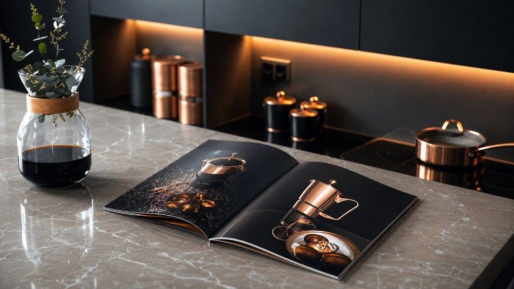
Marble holds an open book of copper objects. A pan waits on black glass. A carafe of dark coffee stands with a single green sprig — enough life, not a salad. Behind, a niche glows warm over canisters that look chosen rather than accumulated. The photograph on this article is a design still life. Microcorem’s Bright field note is about material literacy: how objects teach taste faster than most slide culture, and why product people should keep studying things you can pick up.
Why the catalogue is the subject
The open book is not set dressing. It is the point. Someone photographed copper with care — splash, silhouette, weight implied by light — and someone else left that book open on a real counter. Taste moves from page to room. Digital product teams often reverse the order: decorate the interface first, then hope the underlying object (workflow, data, promise) feels premium. Objects are less forgiving. Copper either holds polish or it shows fingerprints.
Material lessons for product surfaces
Steal the kitchen’s standards without stealing the kitchen:
- Fewer materials, better finishes — one honest primary surface beats five competing textures.
- Warmth needs a source: light, hierarchy, or a single accent that earns its copper.
- Utility on display: the pan is for cooking; the UI control should be for a real job.
- Storage with intention: canisters in a niche, not tools scattered across every drawer (and every nav item).
Taste as an operating skill
Taste is not fluff adjacent to engineering. It is how teams decide what “done” looks like when the checklist is green and the room still feels wrong. Looking at objects — cookware, type, architecture, a well-made tool — trains that judgment. Microcorem’s studio work across platforms and commerce keeps returning to the same standard: the thing should feel inevitable in the hand, not only impressive in the deck.
A short checklist before the next interface pass
Before you add another visual layer, ask:
- What is the “copper” — the one material that must hold polish?
- What belongs in the niche (owned, lit, few) versus the junk drawer?
- Would this object teach taste if we photographed it without copy?
- Are we designing the pan — or only the catalogue page?
What this means for Microcorem
This In Colour note uses a dark kitchen and copper catalogue as atmosphere for object-led taste. It is not a cookware partnership, a interiors client claim, or a pivot into product photography for hire. Microcorem stays a product engineering studio — with Bright field notes for the cultural side of how good systems feel.